The aim was to highlight what makes Kempele attractive and develop a visual identity that is versatile and can easily be used in different applications. The customer produces a lot of marketing material on their own, so the starting point for the design was to make a visual identity that is easy to adapt.
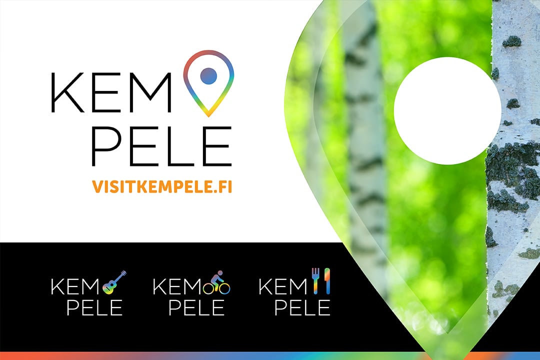
The visual identity we created for Visit Kempele is based on the use of fresh clean white surfaces with blazingly colourful graphic shapes. The idea is to keep the general appearance simple and calm, while allowing for freedom to play with the graphic elements. The Visit Kempele logo draws on the idea; the simple black logo text is followed by a colourful symbol signifying location.
When necessary, the location symbol can be substituted with other symbols that describe Kempele or the services it has on offer, thus violating traditional restrictions on logo usage. The shape of the symbol is used to outline large images. On posters, brochure covers and other large surfaces, the image cut into the shape of the location symbol functions as a window into the diverse tourism offering of the municipality.
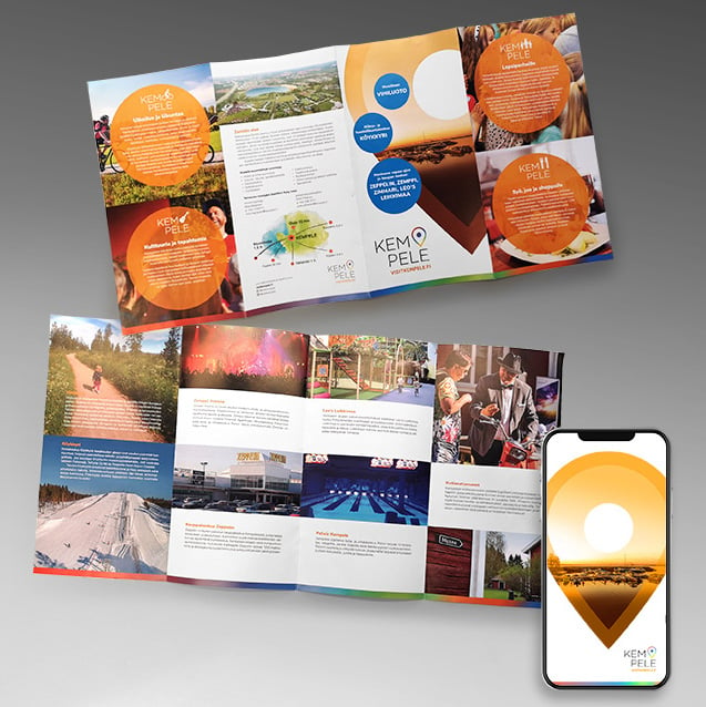
In addition to the logo design, we designed templates for brochures and forms, filters for social media images and an 8-page travel brochure.